Building a Zoho Analytics Dashboard: Filters, Drill-Down & Sharing
A Zoho Analytics dashboard is the difference between answering one question and answering the question behind the question. When your sales lead asks why revenue is down this month, they do not want three separate report tabs — they want one screen where they can trace the drop from category to region to rep without asking you to re-run anything. This post shows you exactly how to build that screen in Zoho Analytics: combining multiple reports into a dashboard, wiring up cross-report filters that update every chart simultaneously, enabling drill-down, and sharing it with someone who has never logged into Zoho.
This is Part 2 of the Zoho Analytics tutorial series. If you have not yet set up your workspace and first report, start with Part 1 — Setup & First Report before continuing. Part 3 covers connecting Zoho CRM directly to your workspace for automatic data sync.
Table of Contents
What You Are Building
By the end of this post you will have:
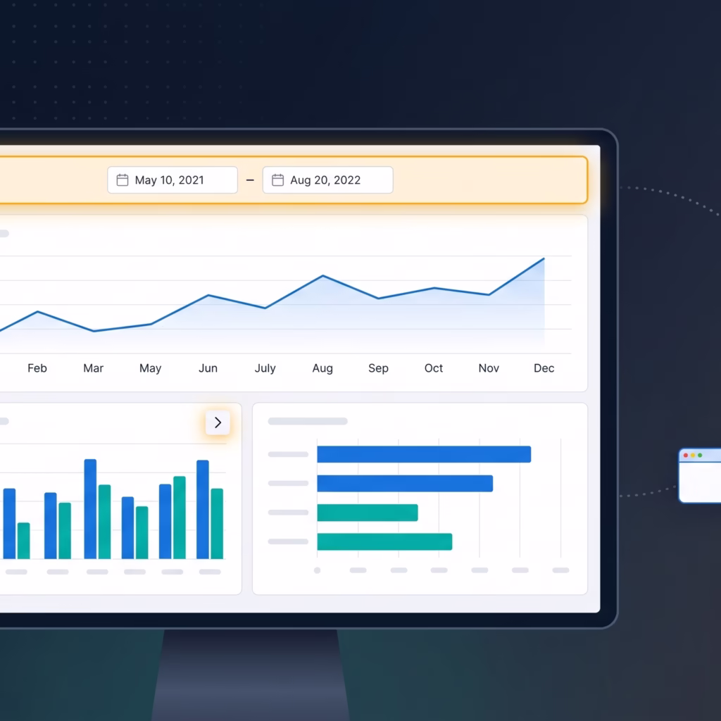
- A Zoho Analytics dashboard containing three charts — revenue trend, category breakdown, and units sold
- A date range filter that updates all three charts simultaneously
- A drill-down from a category bar to product-level detail
- A public or password-protected shareable link for stakeholders without a Zoho account
Before You Start
You need the workspace and the Revenue by Category bar chart from Part 1. Log into your account at analytics.zoho.com and open that workspace. The steps below depend on having that table and report already in place.
Step 1 — Create Two More Reports
A Zoho Analytics dashboard built on a single chart is just a larger chart. You need at least three reports before building the dashboard so there is something meaningful to combine and filter together.
Report 2 — Monthly Revenue Trend (Line Chart)
Open your sales table and click + New → Chart View. Configure:
| Field | Setting |
|---|---|
| Chart type | Line |
| X-Axis | Date — group by Month |
| Y-Axis | Revenue — aggregation: Sum |
Save as Monthly Revenue Trend. This chart will anchor the top of your Zoho Analytics dashboard and give stakeholders immediate time-series context before they read the category or product breakdowns below.
Report 3 — Top Products by Units Sold (Horizontal Bar)
Create another chart view with these settings:
| Field | Setting |
|---|---|
| Chart type | Bar (Horizontal) |
| Y-Axis | Product |
| X-Axis | Units — aggregation: Sum |
| Sort | Units descending |
Save as Top Products by Units Sold. You now have three reports ready to combine into a Zoho Analytics dashboard: Revenue by Category, Monthly Revenue Trend, and Top Products by Units Sold.
Step 2 — Assemble the Zoho Analytics Dashboard
From the workspace home, click + New → Dashboard. Name it Sales Overview.
The Zoho Analytics dashboard opens in edit mode. Click + Add Widget and select Monthly Revenue Trend. Drag it to span the full width at the top — time-series context anchors everything the viewer reads below it. Add Revenue by Category to the lower-left and Top Products by Units Sold to the lower-right.
Zoho Analytics uses a 12-column grid. A widget set to 6 columns takes up exactly half the width. Use the drag handles to resize until the layout is balanced.
Layout principle: Top = what happened (time series). Middle = where it happened (category). Bottom = what drove it (product). This ordering matches how stakeholders naturally scan a Zoho Analytics dashboard.
Click Save Dashboard. The Zoho Analytics dashboard is assembled but each chart still operates independently — that changes in the next step.
Step 3 — Add a Cross-Report Date Filter
A cross-report filter is what transforms a collection of charts into a true Zoho Analytics dashboard. One control updates every widget simultaneously, so a stakeholder can slice the entire screen by time period without touching individual charts.
In dashboard edit mode, click + Add Filter in the toolbar. Configure:
| Setting | Value |
|---|---|
| Filter type | Date Range |
| Column | Date (from your sales table) |
| Apply to | All widgets on this dashboard |
| Default value | Current Month |
Click Apply. Zoho Analytics links the filter to all three charts because they all reference the same Date column from the same underlying table. Test it by changing the range to the last 90 days — all three charts update without reloading the page.
Step 4 — Enable Drill-Down
Drill-down lets a viewer click a bar in Revenue by Category and see the product-level breakdown behind it. This eliminates the follow-up request — the viewer gets the answer themselves inside the Zoho Analytics dashboard.
Right-click the Revenue by Category widget and select Edit Report. In chart settings, click Drill Down → Add Level. Set the second level to Product. Save the report.
Back in the Zoho Analytics dashboard, click the Electronics bar. The chart zooms into revenue by individual product within Electronics. A breadcrumb reads Revenue by Category > Electronics. Click it to return to the top level.
Step 5 — Share the Zoho Analytics Dashboard
Click the Share button in the top-right corner. Choose the method that fits your audience:
Share with Zoho Users
Enter email addresses and assign a role. Read Only allows viewing and filtering but no editing. Read/Write allows adding and editing widgets. Use Read Only for stakeholders who need to monitor the Zoho Analytics dashboard without changing its layout.
Publish as a Public URL
Generates a shareable link. Anyone with the link views the Zoho Analytics dashboard without a Zoho login. You can set a password and an expiry date — the right choice for external clients or executive reviews where creating a Zoho account is not practical.
Embed in a Webpage
Generates an <iframe> snippet. Paste it into your internal wiki, Notion page, or web application to surface the Zoho Analytics dashboard without requiring users to leave their existing tools.
Zoho Analytics Dashboard Best Practices
- Limit to 6–8 widgets. Each widget fires a separate query. Beyond 10–12 widgets the Zoho Analytics dashboard becomes slow and visually overwhelming. Build a second focused dashboard instead of cramming everything into one.
- Name widgets for the question they answer, not the data they contain. “Is revenue trending up?” beats “Monthly Revenue Chart” as a widget title.
- Set a sensible default date range. A Zoho Analytics dashboard that opens on “all time” forces the viewer to filter before seeing anything relevant. Default to current month or rolling 30 days.
- Add a KPI row at the top. A row of summary numbers (total revenue, total units, average order value) above the charts gives stakeholders a quick read before they dig into visualizations.
- Schedule email delivery. Under More Options → Schedule Email, configure a weekly PDF snapshot of the Zoho Analytics dashboard. Recipients stay informed without needing to log in.
Common Mistakes to Avoid
Cross-report filters only bind on matching column names. If two reports query different tables with different date column names, the filter will not connect them. Rename the columns to match, or use a lookup table to join the datasets before building the Zoho Analytics dashboard.
Public URL changes are immediate. Adding a new widget to a published Zoho Analytics dashboard makes it visible on the public URL right away with no additional action. Review public dashboards after every edit to avoid accidentally exposing sensitive data.
Avoid raw table views as widgets. A data grid with 50 columns is not useful to a stakeholder. Summarise data into charts or filtered summary tables. Raw data belongs in the workspace for analysts, not on a shared Zoho Analytics dashboard for decision-makers.
Frequently Asked Questions
How many reports can a Zoho Analytics dashboard contain?
There is no hard cap. In practice, 6–8 widgets is the usable maximum before performance and readability suffer. On the free plan, the 10,000-row limit means queries resolve quickly regardless. On paid plans with millions of rows, each additional widget adds measurable Zoho Analytics dashboard load time.
Can I share a Zoho Analytics dashboard without a Zoho account?
Yes. Use Publish as URL in the Share menu. The recipient opens the Zoho Analytics dashboard in a browser with no Zoho login required. You can protect the link with a password and set an expiry date. This is the standard method for external client reports and executive reviews.
If I edit a report, does the Zoho Analytics dashboard update automatically?
Yes. Reports and dashboards are linked, not copied. Editing a report’s chart type, axes, or filters reflects immediately in every Zoho Analytics dashboard where that report appears as a widget. This means you update once and all dashboards stay current — but test report edits before modifying a dashboard shared with live stakeholders.
What Is Next in This Zoho Analytics Series
Your Zoho Analytics dashboard is live, filtered, drill-down enabled, and shareable. But if your actual revenue data lives in Zoho CRM — deals, contacts, pipeline stages — you are still exporting CSVs manually to feed it. Part 3 eliminates that.
Part 3 — CRM Integration connects Zoho CRM directly to Zoho Analytics via the native connector: automatic nightly sync, deal pipeline reports, and the prebuilt CRM template covering quota attainment, win rate, and sales cycle length. If you are setting up CRM for the first time, our Zoho CRM implementation guide walks through the full setup before you connect it to analytics.
Part of the Zoho Analytics Tutorial Series — a practical guide for teams moving from spreadsheets to connected, automated business intelligence.
Share this content: